HPE Style Guide 2016
Art Direction / Lead Product Designer / Brand
As part of the style guide team we delivered a complete redesign of the corporate brand to be used by the different groups, aligning them to present solid cross-organization look and feel.
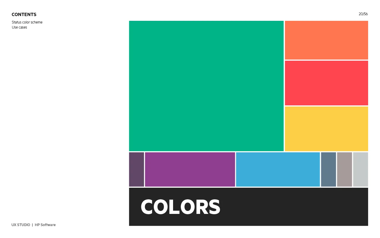
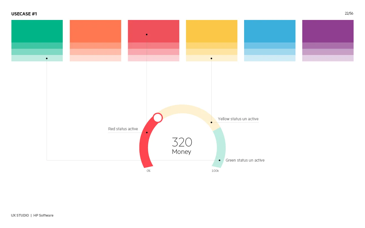
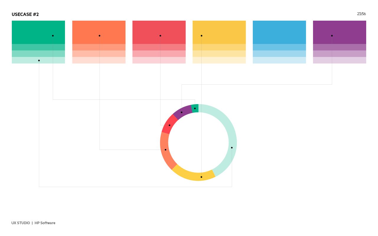
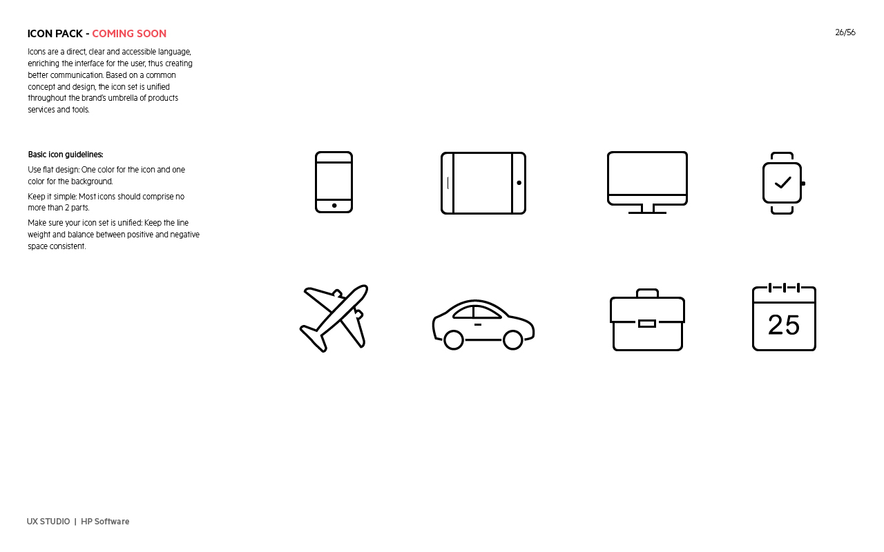
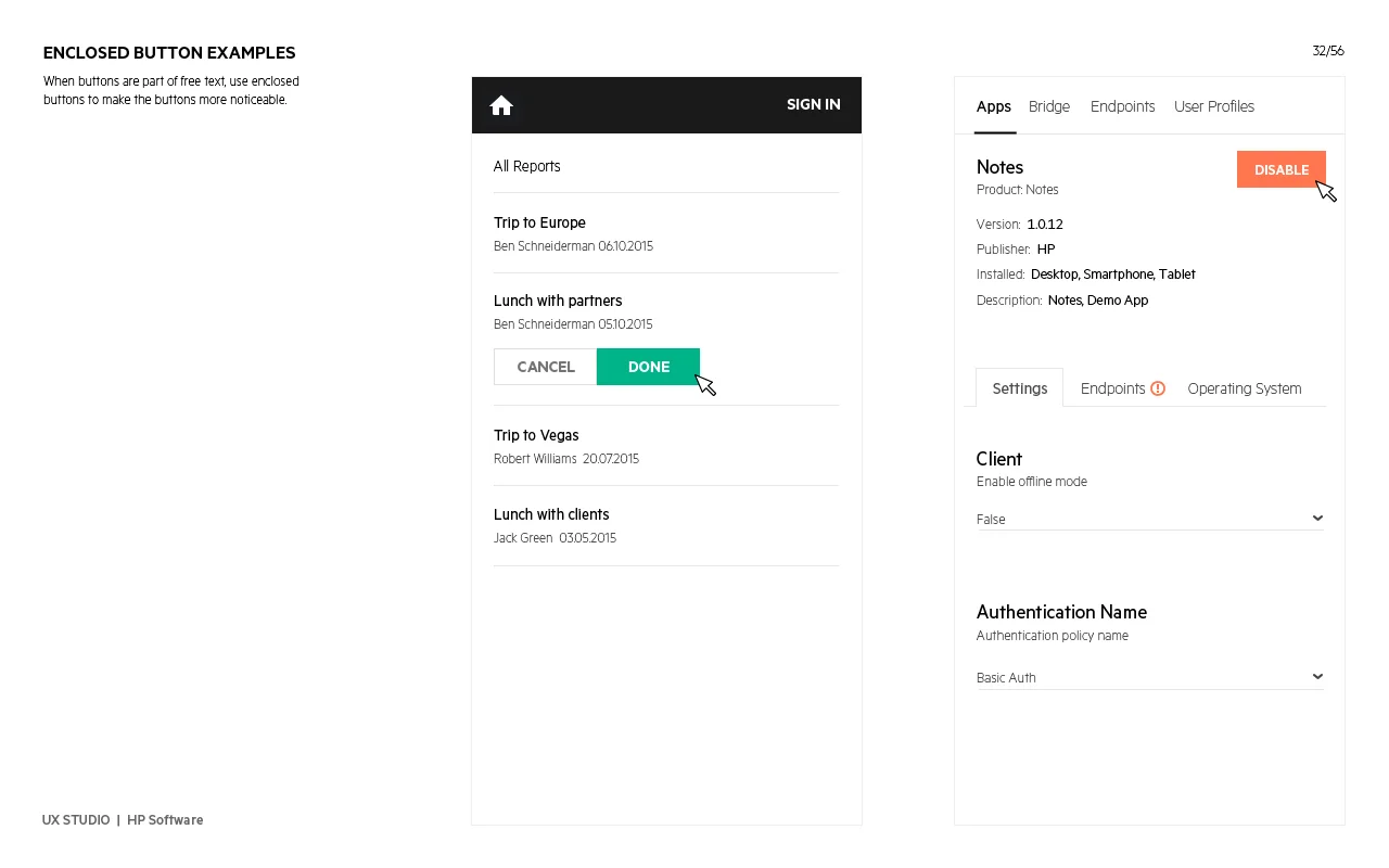
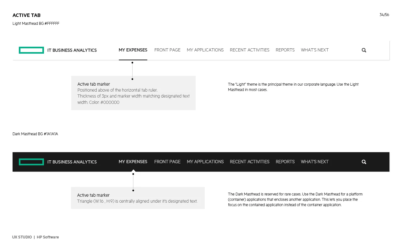
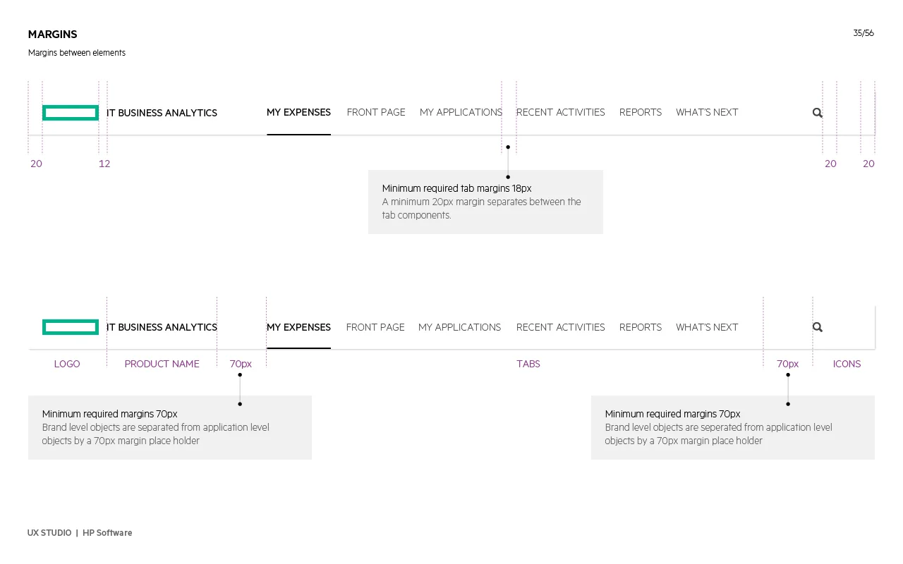
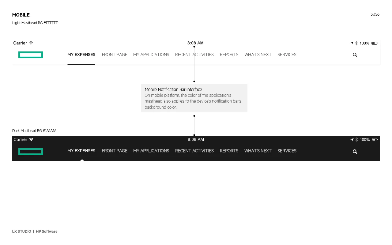
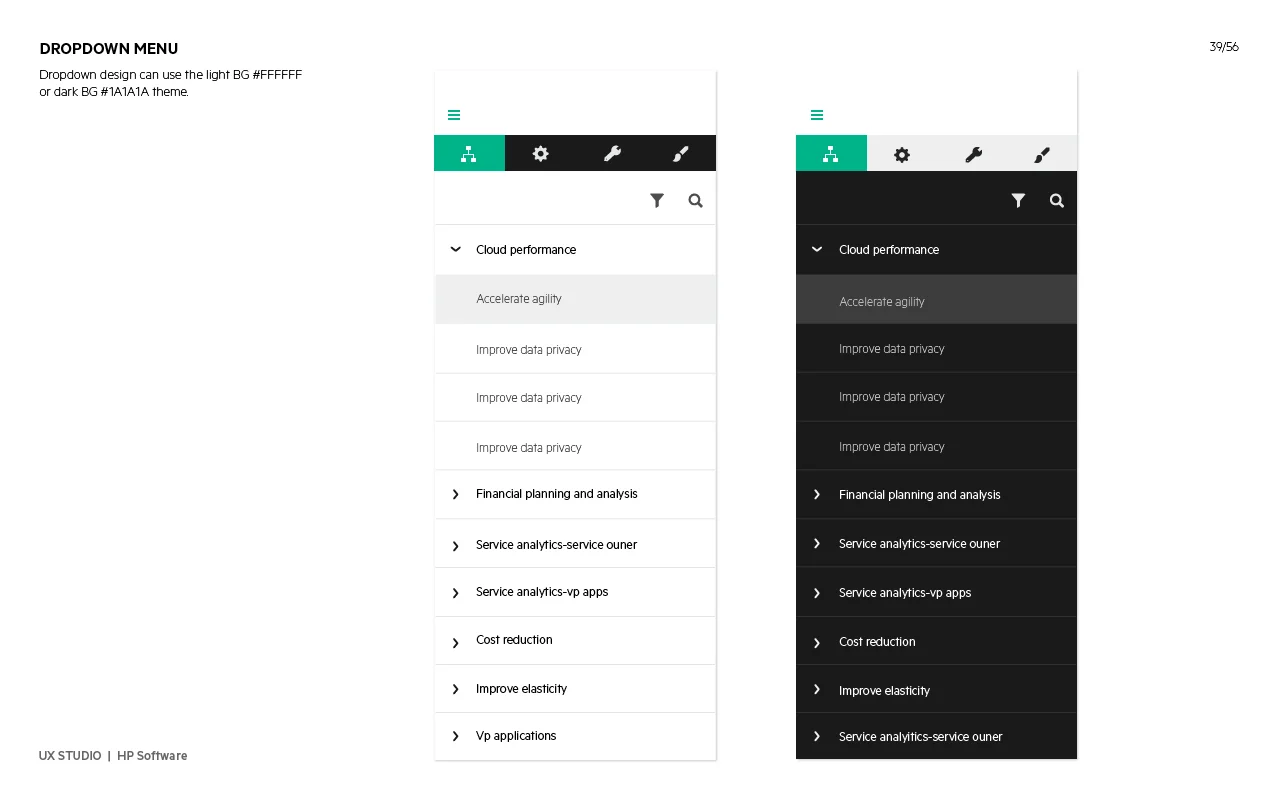
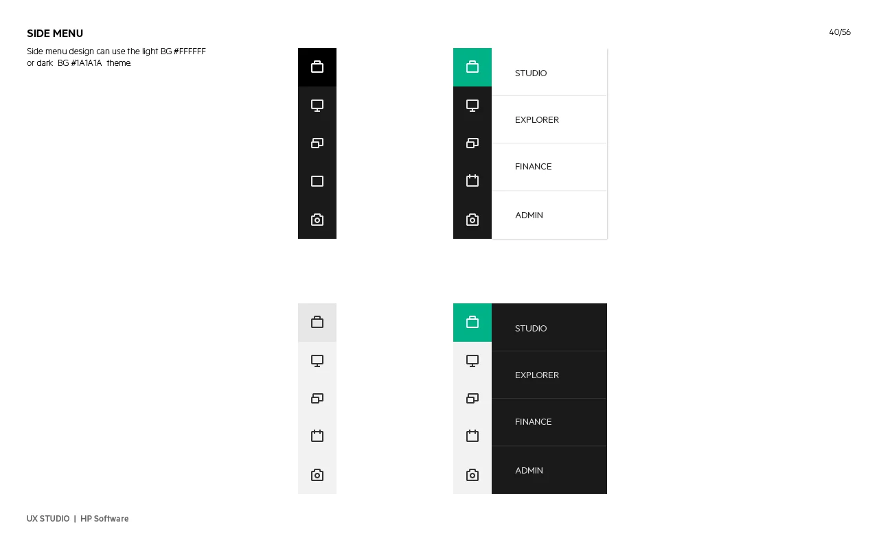
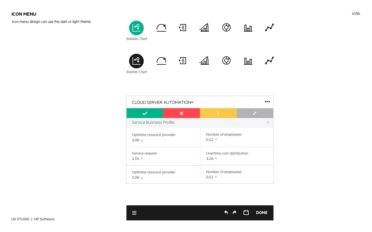
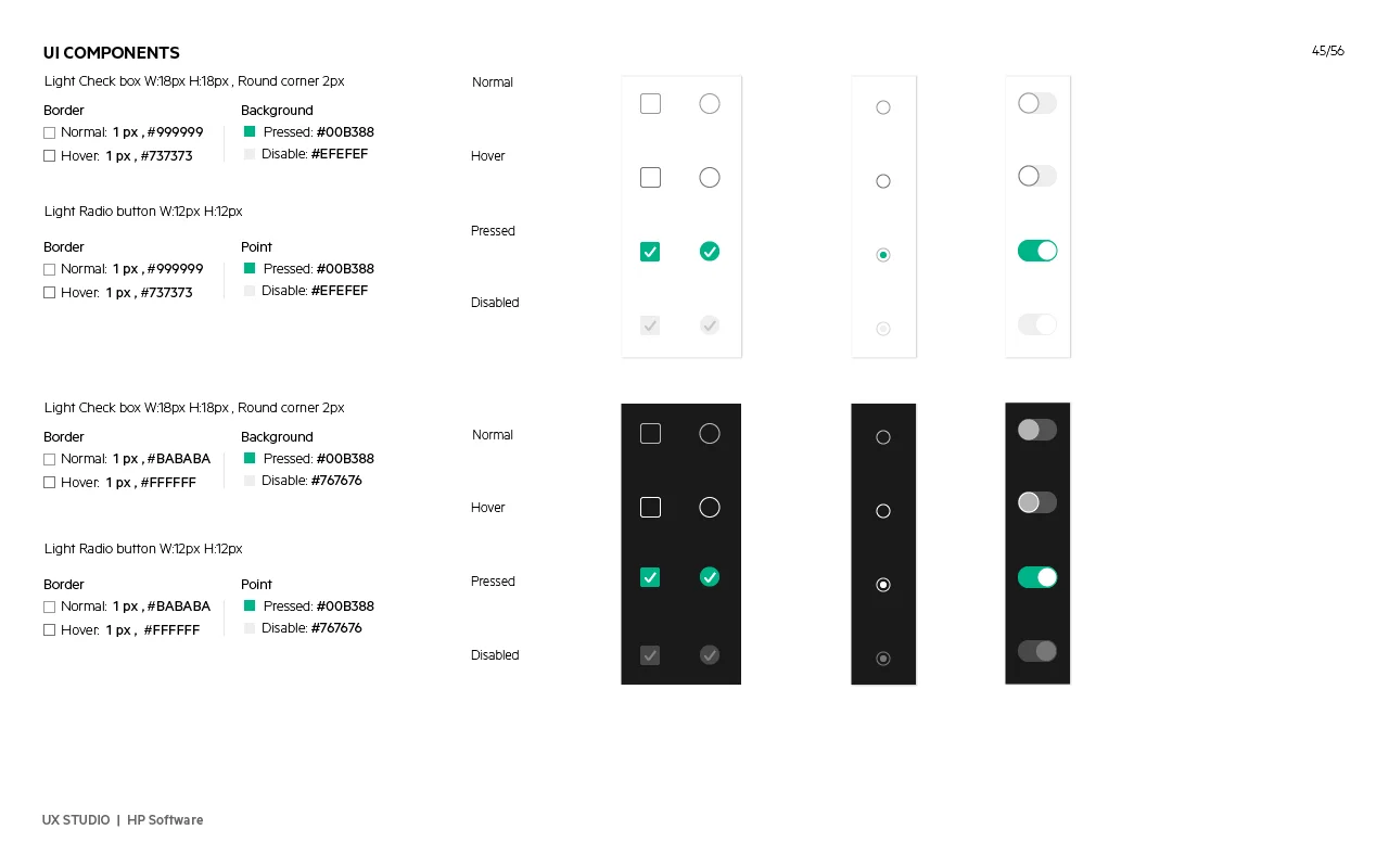
Creating the graphical language included: second level colors, status colors, brand icons and a common component library to be used in the different products
BACKGROUND
With HP transition to HPE, the corporate logo, font and brand color were changed.
These changes resulted in additional modifications to the color palate, graphical language, placement of the corporate logo on company buildings, cars, cups and such.